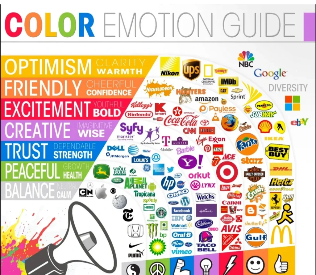
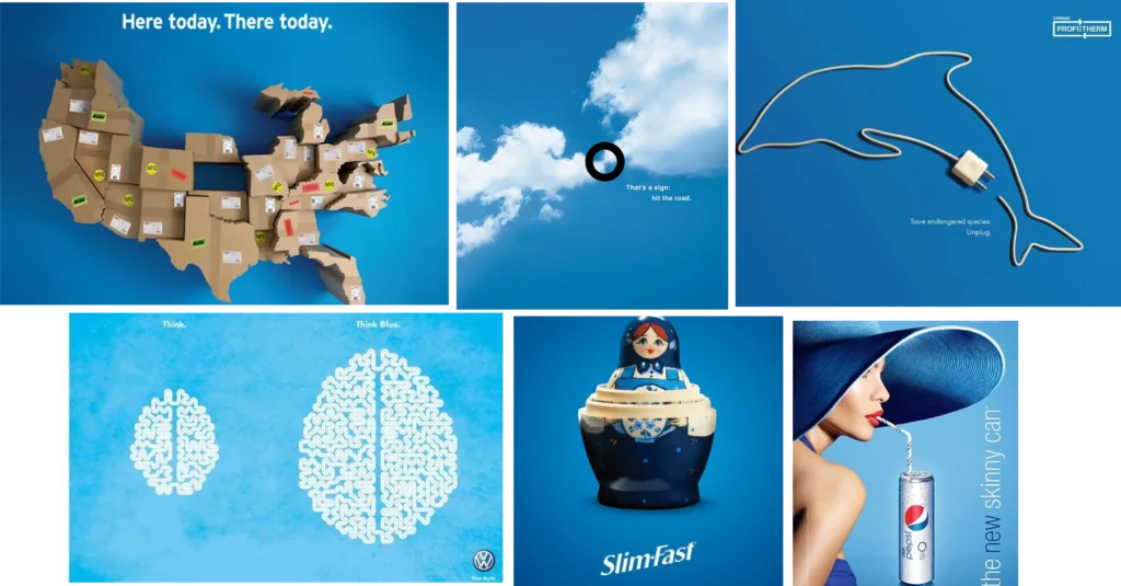
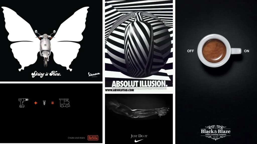
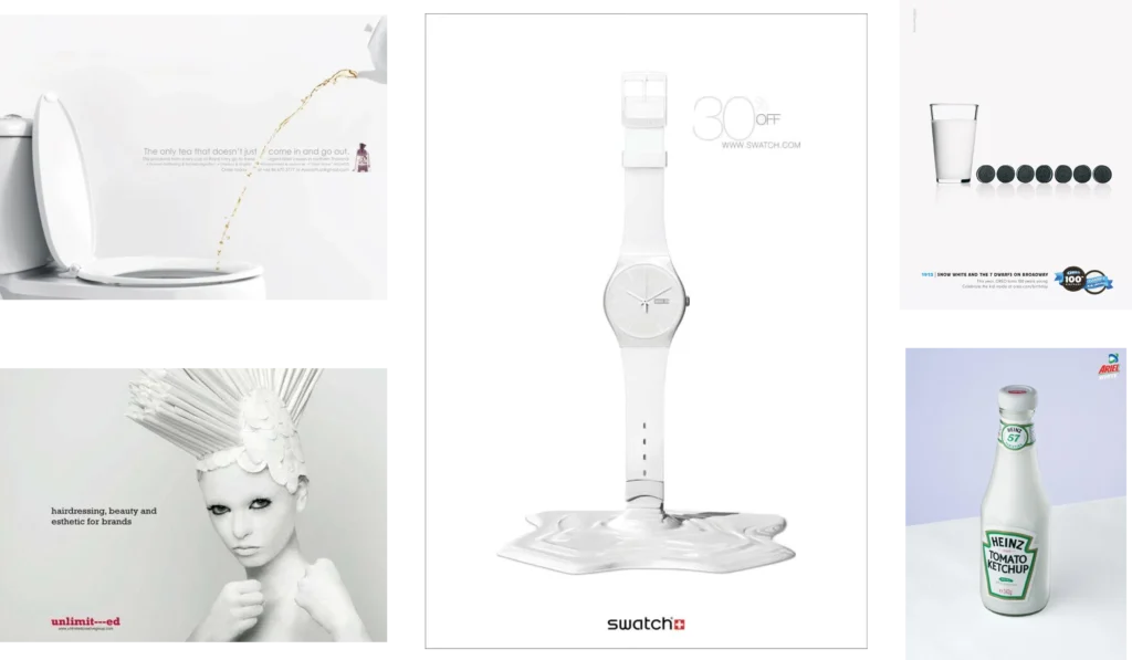
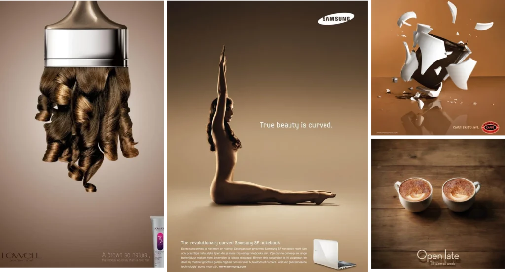
Colors as a Guide For Emotions
We all know that we are sensitive to colors and that we associate certain concepts with a particular color; love is red, nature is green and we can continue like this forever. However, did you know that colors have a concrete impact, even subconsciously, on your mood and even on your actions? Here I wanted to share with you a guide of colors linked with emotions.
RED : red is one of the colors that impact us the most! It has been proved to increase blood pressure and give a feeling of energy. More surprisingly, it increases your appetite and thirst. Indeed, it has been shown that eating in a red plate will make you eat more than in a plate of another color. Red also get easily your attention, evokes love but also anger, rage, impulsiveness, courage, and danger. Think about Ferrari, when we see a Ferrari in the street, it attracts our eyes, and provoke a feeling of energy. When we see a Coca-Cola can, our increasing blood pressure and thirst makes you want to drink one.

PINK : historically, we tend to associate pink with females. Even if the society and the trend are slowly changing, the centuries of this color association remains powerful in our subconscious. Think about the sub-brand of Victoria Secret: Pink, it could not be more exhaustive. This color is also strongly associated with innocence and sweetness.

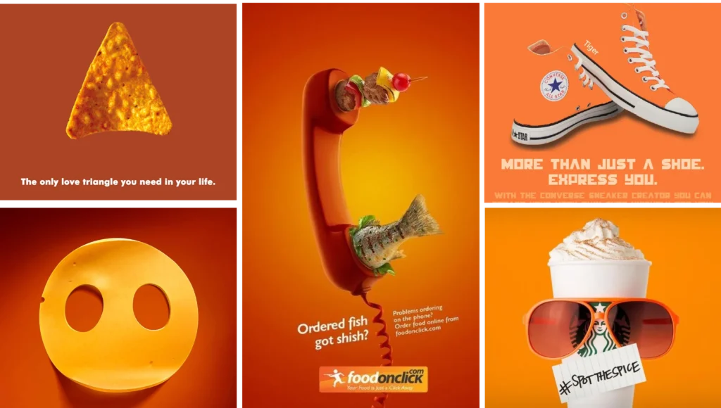
ORANGE: associated with food and drink, it is also synonymous with good health, warmth, vibrant, energizing and bold. It is also a color associated with youth. Then, it is not surprising that most food and drink brands that use orange as their main color to focus on young customers, associated with a feeling of fun.
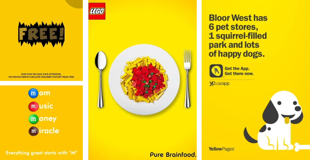
YELLOW: even if difficult to look at in large quantities, yellow stimulates memory and is associated with value, sunshine, enlightenment, and cowardice. Brands carefully use this color as it can easily lose its ease of reading if the color is too much used.
OR : we can also link yellow with metallic gold, which is perceived as sophisticated and elegant. It provides an aspect of quality and expensiveness.

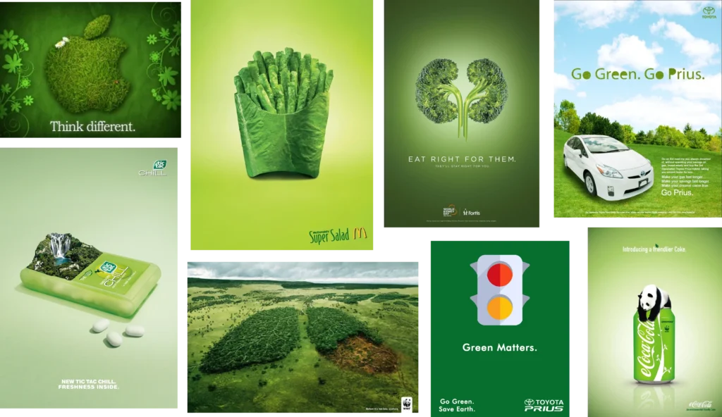
GREEN : we all tend to associate green with nature. With time, this associated has strengthened in our mind and, derived from it, we also tend to link this color with outdoors and growth. Moreover, from a more tangible aspect, green is the easiest color to see for the eyes, then, green is perceived as a “cool” color and provides relaxation and comfort. Today, brands tend to use green for every product that has a direct or indirect link with nature, ecology, and environmentally friendly, a usage that will strengthen these associations in our minds.
BLUE: at the opposite of red, blue lower the blood pressure and is then a “very cool” color. Proving to calm our mood, it is the most popular color. It is also associated with intellectual and conveys trust. We also tend, in a less powerful way, to associate blue with dependable.
PURPLE : this color is difficult to figure out its exact meaning because it combines red (hot) and blue (cool). It can excite, increase appetite but still lower blood pressure and be calming. Today we tend to associate purple with royalty, religion, bravery, imagination, but also creativity.

BLACK : this color is neutral but can have both negative and positive associations. It is synonymous with sophistication, elegant, mysterious, powerful and worldly. It is often combined with white to create a feeling of drama and contrast.
WHITE : it is an easy to associate color: freshness, purity, and cleanliness come directly to mind. However, it also has strong links with youth and innocence.
BROWN : Associated with the concepts of comfort and “warmth”, brown is used to convey an effect of confidence and solidity.
GREY & SILVER : when gray is associated with guarded, disciplined, planned, intelligent, bland but sophisticated; silver is more for glamorous and highly positive feelings.

Here you can find a summary of all the brand associations and concrete examples: